Brand Book · 2026 Edition

Premium beverages and the artisan appliances that bring them to life.

Industry
Beverages & Home Appliances
Audiences
B2C · B2B
Contact
mark@frescopa.coffee

Fréscopa is a fictional demo brand created for demonstration purposes only. All names, logos, products, and brand materials are invented. Any resemblance to a real company, product, or brand is entirely coincidental and unintended.

Scroll

01

Brand Positioning

Frescopa sits at the intersection of premium beverage culture and sophisticated appliances — a lifestyle brand for consumers and an end-to-end beverage solutions partner for businesses.

From the home counter to the commercial kitchen, Frescopa owns the full spectrum. Whether it is a morning juice, a precision-brewed coffee, or a perfectly steeped tea, every step of the experience is designed end to end.

From the leaf, the bean, and the fruit to the perfect cup — every step of the experience, designed by Frescopa.

Brand Personality

Warm and knowledgeable — the expert friend who makes premium feel earned, not exclusive.

B2C — Consumer

Discerning home enthusiasts Health-conscious consumers Design-forward appliance buyers Café culture lovers

B2B — Business

Enterprise & Corporate Hospitality Food & Beverage Operators Property Developers Co-working Spaces

What We Offer — B2C

The Frescopa consumer experience spans beverages, appliances, and immersive retail — a complete ecosystem for people who take their daily ritual seriously.

01

Coffee & Tea

A curated range of single-origin beans, artisan blends, and fine loose-leaf teas. Every product is responsibly sourced and crafted to bring out complex, satisfying flavour.

02

Fresh Juices

Cold-pressed and freshly extracted juices made from premium, naturally sourced produce. Vibrant flavours designed for health-conscious consumers who refuse to compromise on taste.

03

Appliances

Premium brewing, steeping, and juicing devices engineered for performance and designed to be displayed. From bean-to-cup machines to cold-press juicers, every device reflects Frescopa's commitment to craft.

04

Frescopa Cafés

A café and showroom experience where customers taste the full beverage range, explore the appliance line, and immerse themselves in the Frescopa world. Part retail, part education, part community gathering place.

Appliances and cafés transform Frescopa from a consumables brand into a lifestyle ecosystem. Customers don't just buy a product — they buy into a ritual that Frescopa designs end to end.

03

What We Offer — B2B

Frescopa Business Solutions brings our premium experience into workplaces, hotels, cafés, and commercial venues. One partner for machine, supply, and service.

One partner. Machine, supply, and service — so your team never misses a great cup.

Equipment Supply

Commercial-grade versions of Frescopa's appliance range, specified and scaled for high-volume professional environments.

Beverage Supply

Ongoing supply of Frescopa's full consumables range — coffee, tea, and juice inputs — keeping businesses stocked with premium products.

Fit-Out Consultancy

End-to-end breakroom and café fit-out design, helping businesses create a premium beverage experience that reflects their culture.

Installation & Commissioning

Professional setup, configuration, and staff training to ensure every machine performs from day one.

Service & Maintenance

Scheduled servicing, preventative maintenance contracts, and rapid-response repair to keep operations running.

Account Management

Dedicated relationship managers ensuring supply continuity, contract flexibility, and ongoing optimisation.

04

The Frescopa Flywheel

The B2C and B2B arms of Frescopa reinforce each other in a powerful growth loop. The café showroom sits at the centre, bridging both worlds.

B2C

Consumers

Love Frescopa at home, champion it at work

Fréscopa
Cafés
B2B

Business

Experience Frescopa at work, take it home

Home → Work

A consumer discovers Frescopa at home. They love the coffee, the juicer, the ritual. They champion the brand at their office, recommending Frescopa for the breakroom.

Work → Home

An employee experiences Frescopa equipment at work. Impressed by the quality, they purchase Frescopa appliances and beverages for their own kitchen.

Café as Bridge

The Frescopa Café showroom sits at the centre. Consumers visit to explore, professionals visit to evaluate. Both leave as advocates.

06

Color Palette

The Frescopa palette draws from the warmth of coffee, the energy of fresh fruit, and the richness of our heritage. Colors are defined by CSS custom properties as the authoritative source of truth.

Crimson
#A33532
--frescopa-color-brand
Primary brand color. CTAs, key brand moments.
Teal
#00647D
--frescopa-color-primary
B2B lead color. Links, secondary buttons.
Terracotta
#DC6E52
--frescopa-color-secondary
B2C lead color. Headlines, accents.
Amber
#EBA439
--frescopa-color-tertiary
Badges, callouts, juice & energy lines.
Cream
#F4E9DC
--frescopa-color-background
Background. Creates warmth and contrast.
Burgundy
#58181D
--frescopa-color-text
Body text on light backgrounds.
Charcoal
#2C2C2C
--frescopa-color-black
Dark backgrounds. Anchors visual hierarchy.

Color Usage: B2C vs B2B

Terracotta leads in B2C materials. Teal leads in B2B materials. Both operate under the same unified Frescopa identity — a consistent brand with a deliberate visual signal for context.

Crimson on Cream
✓ WCAG AA — body text
Teal on Cream
✓ WCAG AA — body text
Charcoal on Cream
✓ WCAG AAA — body text
Terracotta on Cream
⚠ Headlines only — not body

Always verify contrast ratios before using color combinations not listed above. Never place Amber on Cream for text use.

Typography

Playfair Display for headlines, DM Sans for body copy — both open-source, screen-optimised, and available via Google Fonts. Warmth and modernity in equal measure.

Display
Playfair Display
Bold / Italic
28pt+ / Headlines
Letter-spacing: −0.02em
From bean
to cup.
Premium, always.
ABCDEFGHIJKLMNOPQRSTUVWXYZ · abcdefghijklmnopqrstuvwxyz · 0123456789
Body
DM Sans
Regular / Medium
16px body · 11pt print
Line-height: 1.7
Frescopa sits at the intersection of premium beverage culture and sophisticated appliances. Whether a morning juice, a precision-brewed coffee, or a perfectly steeped tea — every step of the experience is designed end to end.
ABCDEFGHIJKLMNOPQRSTUVWXYZ · abcdefghijklmnopqrstuvwxyz · 0123456789
Mono
DM Mono
Regular / Medium
Labels, tokens,
captions, metadata
--frescopa-color-brand: #A33532;
--frescopa-color-primary: #00647D;
B2B AUDIENCE · ENTERPRISE · HOSPITALITY
mark@frescopa.coffee · 2026 Edition

Type Hierarchy

Display Playfair Display Bold 28pt+ Heading 1 Playfair Display Bold 22pt Heading 2 Playfair Display Bold 16pt Body DM Sans Regular 11pt Caption DM Sans Regular 9pt

08

Brand Voice & Tone

The Frescopa voice is warm, approachable, and full of genuine enthusiasm. We speak like a knowledgeable friend — never lecturing, always inviting. This voice applies equally across B2C packaging and B2B proposals.

✓ We sound like…
"Start your morning with something special."
"Real fruit. Real energy. Real good."
"Brewed with care, shared with love."
"One partner for every cup in the building."
✕ We never sound like…
"Our Yirgacheffe has tasting notes of…"
"For the discerning palate…"
"Leverage synergies to maximise…"
"Only true connoisseurs appreciate…"

When in doubt, ask: Would I say this to a friend over a cup of coffee? If yes, you're on brand. If not, simplify.

Sensory

Evoke excitement and curiosity about beverages and the rituals around them.

Honest

Speak straightforwardly. Use everyday language that everyone understands.

Warm

Be approachable and relatable. Authentic and conversational — never corporate.

Clear

Simple, short sentences that land with clarity. Warmth and connection in every line.

The B2B register shares the same warmth and clarity as B2C, but shifts tone to reflect professional context — confident rather than playful, outcome-focused rather than sensory. The expert friend becomes the expert partner.

In a proposal or pitch
"We'll handle everything from machine specification through to ongoing supply — so your team always has what they need, without the admin."
Warm, outcome-focused, human. No jargon.
In a contract renewal
"Your account is up for renewal next month. We'd love to talk through what's working and what we can do better — let's get 20 minutes in the diary."
Relationship-led, direct, no filler.
In a cold outreach email
"Most breakrooms settle for average. We think your team deserves better — and we make it easy to get there."
Confident, provocative, brief. Still warm.
Never in B2B
"Our end-to-end synergistic beverage ecosystem delivers ROI-driven solutions at enterprise scale."
Corporate jargon kills the brand even in B2B.

Editorial Guidelines

Consistency in writing reinforces the Frescopa brand across every touchpoint — from product packaging to B2B proposals.

Writing Rules

Clearly state the main benefit of the offer.
Use serial commas (e.g., coffee, tea, and juices).
Use ending punctuation on all sentences.
Always capitalise Frescopa — it is a proper noun.
Keep sentences concise and impactful.
Use sentence case for headlines and body copy.
Use active voice whenever possible.

Restrictions

Avoid coffee-specific jargon unless widely adopted.
Avoid word repetition within the same sentence or paragraph.
Avoid promoting the skill level or experience of the drinker.
Do not use technical language or insider jargon.

Examples

✓ "Wake up to rich, smooth flavour — now in three new blends."
✕ "Our artisanally crafted, micro-lot, third-wave coffee experience…"
✓ "Fuel your day the natural way with Frescopa Energy."
✕ "Leverage our proprietary energy formulation for peak performance."
✓ "One partner. Machine, supply, and service."
✕ "End-to-end synergistic beverage ecosystem solutions."

B2B Document Note

In formal B2B documents (proposals, contracts, service agreements), standard legal and contractual language is exempt from editorial tone guidelines. Apply brand voice to executive summaries, cover letters, and relationship-facing sections only. Never apply informal phrasing to pricing schedules, terms, or SLAs.

10

Image Guidelines

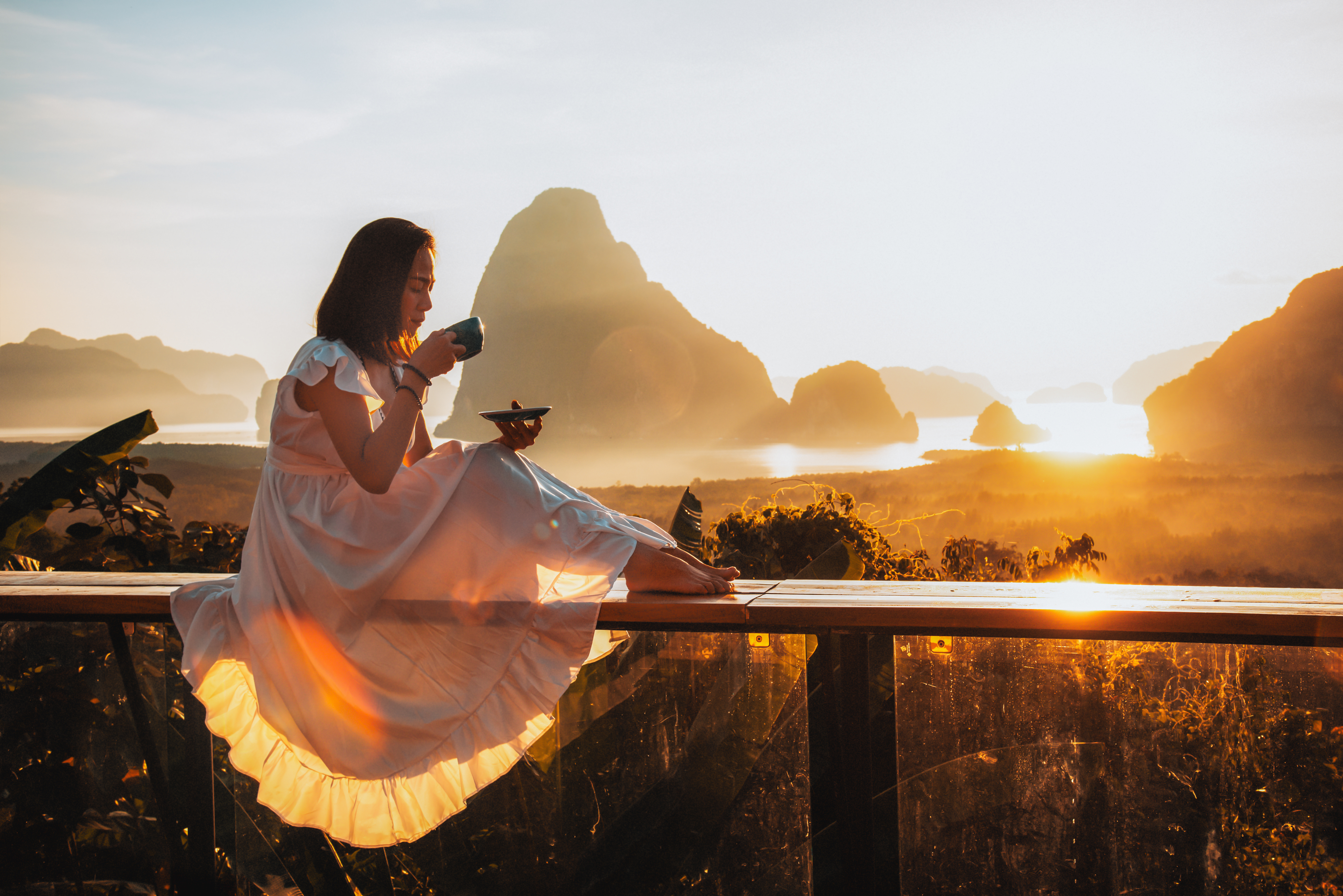
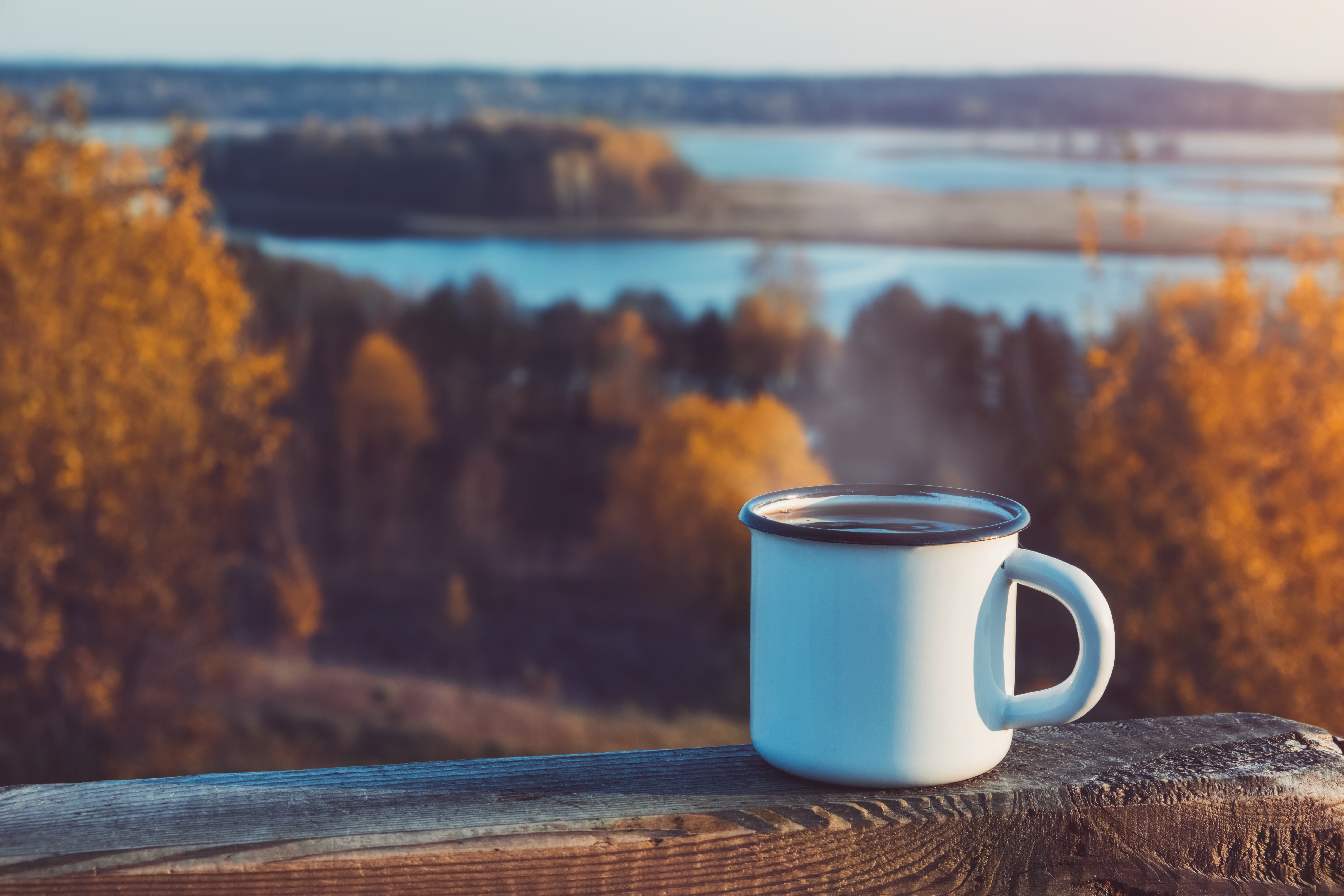
Photography at Frescopa tells a story. Every image should feel warm, inviting, and authentic — whether showcasing a home kitchen ritual, a sleek appliance, or a bustling café environment.

Composition

Centre imagery around the experience and emotions. The product or appliance should feel like a natural part of the scene, not the subject of a product shoot. Allow breathing room — negative space is as important as the subject.

Environment

Focus on cozy settings and natural environments — a sunlit outdoor café, a morning balcony, a modern breakroom, or a vibrant street scene. The environment should feel lived-in and real, never constructed.

Color

Use a palette inspired by coffee — browns, creams, ambers, and earthy terracottas. For juice and energy lines, incorporate fresh greens, warm ambers, and vibrant fruit hues. The overall image should feel warm; avoid cool, desaturated, or high-contrast editorial tones.

Lighting

Warm, natural light always. Golden hour is ideal — it saturates the scene in amber tones that are deeply on-brand. Avoid harsh flash, artificial studio lighting, or cool-toned daylight that makes the scene feel clinical or corporate.

People

When people appear, they should feel at ease — not posed. Capture moments of genuine enjoyment, quiet contemplation, or relaxed connection. Diversity in age, background, and setting is encouraged. People are the ritual, not models for it.

Restrictions

No cluttered or busy backgrounds. No staged, stock-photo-feeling compositions. No heavy filters that distort natural colors. Never crop a product in a way that hides its identity. Avoid adventure, sport, or utility contexts — these are off-brand for Frescopa's premium lifestyle positioning.

The following images represent approved reference photography. Use these as a calibration point when selecting or commissioning new imagery.

Man at outdoor café with coffee
Example 01 · Lifestyle — Café
The relaxed ritual. Natural light, outdoor setting, genuine ease.

Why it works

The subject is relaxed, not posed. Warm terracotta tones in the architecture echo the brand palette. The teal cup creates a deliberate brand color moment without being forced. The outdoor city café context directly supports the Frescopa Café positioning.

Warm tones Natural light Authentic mood Café context

Why it works

This is the Frescopa ideal — golden hour light saturates the entire frame in Amber tones that map perfectly to the brand palette. The subject is quiet and contemplative, embodying the ritual over the product. The dramatic landscape backdrop elevates the moment without competing.

Golden hour Aspirational Ritual moment Hero-grade

Recommended use: hero banners, campaign pages, social hero posts

Woman drinking coffee at golden hour sunrise
Example 02 · Lifestyle — Golden Hour
The aspirational moment. Amber light, stillness, pure ritual.
Enamel mug on wooden rail in autumn landscape
Example 03 · Still life — Atmosphere
Warmth and nature. Amber tones, wooden texture, seasonal mood.

Conditional use

The autumn color palette and warm light are strongly on-brand. This works well as a supporting atmospheric image for seasonal campaigns or editorial content. However, the enamel mug reads rustic rather than premium — this image should not be used to represent Frescopa product or appliances directly. Pair with product imagery or brand copy to anchor the context.

Warm palette ✓ Seasonal mood ✓ Not for product use ⚠

Recommended use: seasonal email headers, editorial backgrounds only

11

Brand Values

Our values are the foundation of everything we do at Frescopa — from the products we create to the partnerships we build. They guide decisions across B2C and B2B.

Sustainability

Responsible sourcing, eco-friendly packaging, and reducing our environmental footprint from farm to cup.

Craftsmanship

Meticulous attention to detail in every product and appliance. We never cut corners on quality.

Community

Bringing people together in homes, workplaces, and cafés. Investing in the communities where we operate.

Inspiration

A great beverage can spark an idea, fuel a conversation, or brighten a moment. We create products that inspire.

Quality

From ingredients to appliance engineering to customer experience — quality is non-negotiable at every level.

These values are not just words — they are promises we keep every day.

Text Checks

Use these checks to evaluate brand-facing copy before publication. Each check defines pass, fail, and not-applicable conditions.

Sophisticated Voice
Text Check

On core brand and product communications (e.g., homepage, product pages, brand story, campaign pages), the tone should feel at least somewhat sensory, warm, or inviting. Ideal language evokes taste, aroma, and emotion, and uses confident, conversational phrasing. However, it is not required that every sentence be poetic or richly metaphorical.

Consider this check PASSED if there are clear signs of care in wording (e.g., appealing descriptions of coffee, atmosphere, or experience) and the overall tone is premium. Only mark this check as FAILED when a major brand-facing page is consistently flat, cold, overly technical, or generic in a way that weakens the brand experience, and there are no noticeable attempts at sensory or emotional language. For transactional, legal, or purely technical copy (e.g., system messages, cookie notices), neutral language is acceptable and this check may be treated as NOT APPLICABLE.

Naming & Lexicon
Text Check

For coffee products, blends, and branded experiences, aim to use at least some evocative or memorable names (e.g., 'Morning Muse', 'Midnight Oil') and sensory, specific descriptions where it makes sense (aroma, taste, mouthfeel, origin, ritual). Functional names are acceptable for core equipment, categories, or utilities.

Consider this check PASSED if: (a) there is at least some evocative naming OR sensory description used in customer-facing areas, and (b) technical or corporate jargon does not dominate the overall impression. Only mark this check as FAILED if customer-facing naming and descriptions are dominated by generic terms or heavy technical/corporate jargon, with no real attempt at a distinctive or sensory lexicon. For purely technical or infrastructure-related surfaces, technical terminology is acceptable and the check can be marked as NOT APPLICABLE.

Frescopa guardrail: Evocative naming is encouraged — but stop short of tasting-note jargon ("notes of blackcurrant and cedar finish"). Warmth and imagery yes. Connoisseur-speak no. The test: would a knowledgeable friend use this phrase? If it sounds like a wine list, simplify.
No Shouty All-Caps CTAs for Premium Brands
Text Check

Customer-facing text (especially headlines and call-to-action buttons) should avoid shouty ALL-CAPS wording, except for true acronyms (e.g., USA, EU, FAQ). Consider this check FAILED if you see marketing or CTA words longer than 3 letters written in full capitals (for example: "NOW", "FREE", "SALE", "LIMITED TIME ONLY") in buttons, banners, or promotional copy.

Consider this check PASSED if CTAs use sentence case or title case (for example: "Shop now", "Find a location", "Claim rewards"), and all-caps is reserved only for genuine acronyms.

Modern Classic Duality
Text Check

All brand expressions must balance 'Classic Artisan' (quality, tradition, elegance) with 'Modern Innovator' (playfulness, convenience, accessibility). Messaging and visuals should reflect both premium craftsmanship and modern lifestyle.

This guidance applies to substantive messaging and visuals; it is not applicable to short, functional, CTA-like phrases such as "Shop Now" or "Add to Cart".

13

Image Checks

Use these checks to evaluate images before they are published on brand surfaces. Each check defines pass, fail, and not-applicable conditions.

Color Palette
Image Check

Evaluate whether the overall color mood of the image supports a warm, premium beverage brand. The authoritative Frescopa palette is defined in CSS custom properties: Crimson #A33532, Teal #00647D, Terracotta #DC6E52, Amber #EBA439, Cream #F4E9DC, Burgundy #58181D, Charcoal #2C2C2C.

Consider this check PASSED if the image feels broadly aligned with this family (warm browns, creams, soft reds/golds, neutral blacks/whites), even if exact hex values are not perfectly matched. Product photography may include natural materials (metal, glass, stainless steel) and neutrals as long as they do not clash.

Mark as NOT APPLICABLE rather than FAILED for generic third-party products or functional photos where brand colors are not expected. Only mark as FAILED when (a) a core brand asset uses a dominant color that clearly contradicts or confuses the defined palette, or (b) the overall color mood feels cold, neon, or strongly off-brand for a coffee experience.

Imagery & Composition
Image Check

Imagery should support a clean, modern, and inviting coffee experience. Consider this check PASSED if the image is clear, well-lit, and composed in a way that feels intentional (good focus on subject, some breathing room, no harsh clutter or distracting elements) and fits a contemporary coffee context (products, people, coffee moments, equipment).

Lifestyle imagery should feel authentic and welcoming; product imagery should be legible and not overly busy. Only mark this check as FAILED when the composition or style clearly harms the brand (e.g., very cluttered, low-quality, confusing subject, or obviously unrelated to coffee or the Frescopa context).

Packaging & Application
Image Check

Apply this check ONLY to images that clearly show product packaging or a designed brand surface (e.g., coffee bags, boxes, labels, gift cards, or mockups where the Frescopa brand system is visible). Consider this check PASSED if packaging (a) uses the brand or a close variant of the color family, (b) shows a clear hierarchy between brand name, product name, and key information, and (c) feels consistent with the overall Frescopa look (modern, premium, coffee-centric).

Mark as NOT APPLICABLE for purely decorative illustrations, icons, generic third-party products, or photos where no real packaging or designed brand surface is visible. Only mark as FAILED when visible Frescopa packaging or branded surfaces are present AND clearly break the system (e.g., chaotic hierarchy, completely different style, or no coherence with the rest of the brand).

Developer Files

These two files are designed to be used alongside Claude or any AI assistant when building new Frescopa digital assets. Drop them into the start of any session and the model will have everything it needs to work on-brand from the first message.

design.md
Design Token Reference

The machine-readable design spec. Contains every color token, typography rule, spacing value, component convention, animation principle, and layout pattern — written so an AI can immediately produce correctly-styled output without reading the full brand book.

What it covers
All CSS custom property tokens with hex values and usage notes
Full type hierarchy with sizes, weights, and Google Fonts import
Spacing, layout, and grid conventions
Button, card, callout, and navigation component patterns
Motion and animation principles
Logo color rules per background type
Accessibility contrast ratings for all key color combinations
Download design.md
skill.md
AI Operating Manual

The instructional layer. Tells an AI how to think and behave when building for Frescopa — not just what the brand looks like, but how it speaks, who it's for, and what it absolutely never does. Covers B2C vs B2B switching, voice register, common mistakes, and audience context.

What it covers
Brand personality and positioning in plain language
Full voice rules — always, never, and the test
B2C vs B2B register with worked examples
Audience segments for both arms of the business
Photography guidance and approved image reference
Brand values and how to apply them in copy
Common mistakes table with correct approaches
Download skill.md

How to use these files

01 — Upload both

At the start of a new Claude session, upload or paste both design.md and skill.md before describing your task.

02 — State context

Tell Claude whether you're building for B2C or B2B, what surface (web page, email, document), and what the goal is. The files do the rest.

03 — Keep in the repo

Store both files at the root of the repository alongside this brand book so they stay version-controlled and always match the current brand definition.

Suggested opener:  "I've attached design.md and skill.md for the Frescopa brand. Please read both before we start. I need you to build [describe your task, audience, and surface]."